Case study · Kellogg’s
Kellogg’s, a letter and a toucan in gold
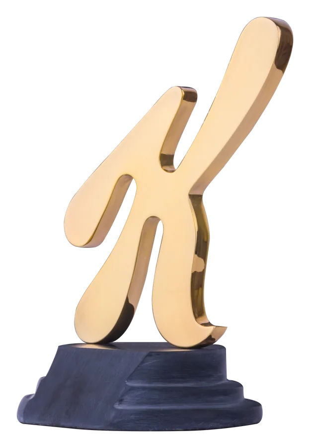
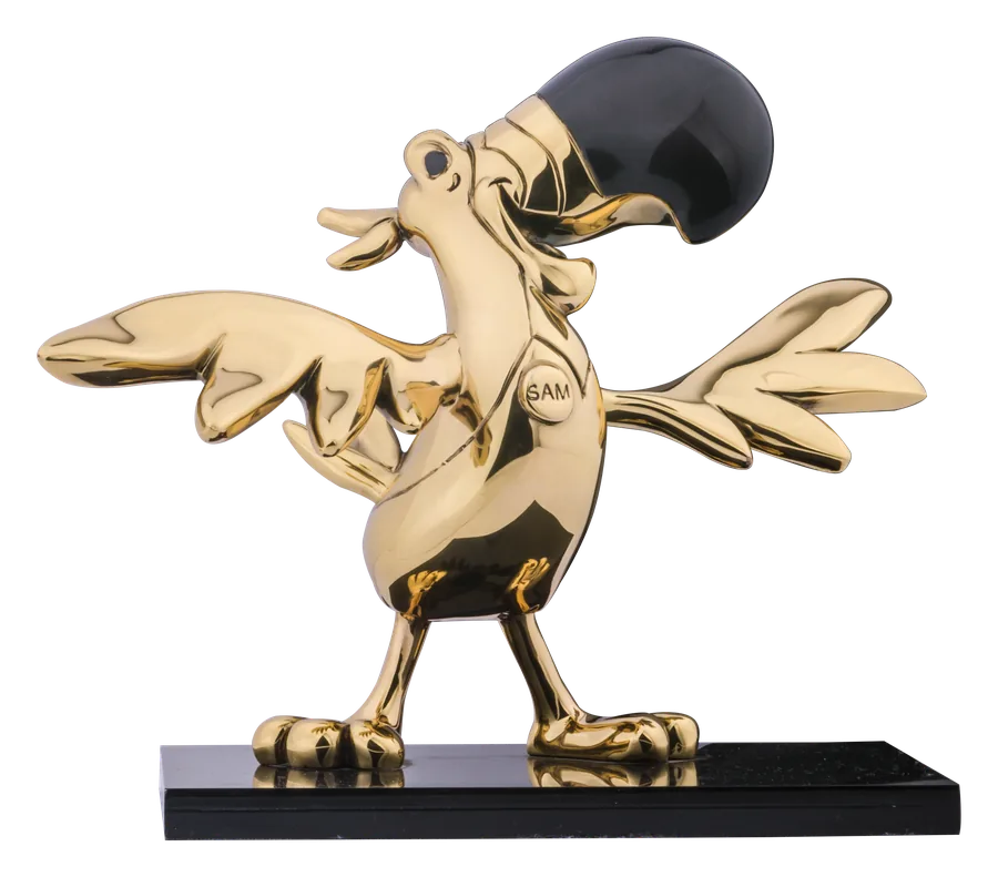
For Kellogg’s, D’Argenta made two very different icons in 24-karat gold: the script K that opens the company’s name, and the toucan of Froot Loops.
- Client
- Kellogg’s
- Pieces
- The Kellogg’s K; the Froot Loops toucan
- Finish
- 24-karat gold
A letter made solid
The K is calligraphy — a brush stroke with thick and thin — and making it three-dimensional means deciding how deep every part of that stroke should be. Done well, it reads as the logo from the front and as sculpture from the side.
A mascot in flight
The toucan is the opposite problem: a character full of personality, wings out, beak high. Gold everywhere except the dark beak keeps it unmistakably the Froot Loops toucan while turning a cereal-box friend into something for a shelf.
Logo or mascot?
Most brands have both, and they do different jobs. A logo piece is formal and works for boards, partners and long service. A mascot is warmer and works for teams, sales clubs and celebrations. Many programmes use one for each.
Keep reading
Start your project
Let us make it in silver and gold.
Closures, bottles, emblems and brand icons, finished by hand in silver, 24-karat gold and copper in Mexico City. A prototype is ready for your review before anything is committed.